yTextbox
Description
The yTextbox component serves as a powerful tool primarily designed for displaying longer text information within your application. It's an element that allows only static content. The yTextbox basically can be used to store text information that goes beyond the context of a simple label.
Basic Structure
In the following the basic structure of the yTextbox shall be explained. For the general structure of a yComponent please visit the
YBase-components basic-structure.
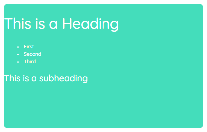
The yTextbox as seen above contains nothing but text as the content.
Content
The content contains the actual text itself. It can be seen as an equivalent to the label of the
yLabel. You can find further explanation at the [Content Property](#style--content).Properties
Through its various properties the yTextbox can be configured to suit your needs. The display below provides you with an overview of all the yTextbox properties.
Properties can be changed directly through three methods:
- Inside the Toolbar, which is positioned in your workarea next to your component where you need it. It shows the most important properties, thus providing a fast and efficient way to configure your component in the most basic way.
- It may also occur in the Toolbar Extension, which is a seamless extension accesible as a dropdown item of the Toolbar. It extends the functionality of the Toolbar by providing advanced pickers for most used properties.
- Inside the Detail Panel, which is located in the righthand drawer. Every property of a component can be configured here.
- Generic
- Style
- Events
METAread more
The identifier of the component that is unique within a page.
The type of the component. For this component it is -textbox.
The custom name of the component. It serves for better identification of the component.
The custom version of the Textbox-component. This can be used to ensure that all components work well together.
The CoreTheme, which will be apllied to the Textbox. For further information on themes visit the themes page.
The subtheme subordinated to the previously specified CoreTheme, which will be apllied to the Textbox. For further information on themes visit the themes page.
The group theme is a further variation of the subtheme which is specified especially for variations of a component inside the subtheme. For further information on themes visit the Theme-Manager page.
DISPLAYread more
This property specifies the display behavior of the component. This can be be set to:
- none
- block
- flex
- inline
This property specifies the type of positioning method used for the component. This can be be set to:
- static
- relative
- absolute
- sticky
- fixed
This property can toggle the visibility of the component. The two modes are completely hidden and fully shown.
SIZEread more
The minimum value for the width of the component. This can be set in:
- px
- pt
- em
- vw
- vh
- %
The minimum value for the height of the component. This can be set in:
- px
- pt
- em
- vw
- vh
- %
The value for the width of the component. This can be set in:
- px
- pt
- em
- vw
- vh
- %
- auto
The value for the height of the component. This can be set in:
- px
- pt
- em
- vw
- vh
- %
- auto
The maximum value for the width of the component. This can be set in:
- px
- pt
- em
- vw
- vh
- %
- none
The maximum value for the height of the component. This can be set in:
- px
- pt
- em
- vw
- vh
- %
- none
The flex property sets the length on flexible items. This sets the value in n-fold shares extrapolated to all other components with the flex display within the same container.
PLACEMENTread more
This property creates a space around the component, outside of the top border. This can be set in percent or pixels.
This property creates a space around the component, outside of the right border. This can be set in percent or pixels.
This property creates a space around the component, outside of the bottom border. This can be set in percent or pixels.
This property creates a space around the component, outside of the left border. This can be set in percent or pixels.
This property creates a space within the component, inside of the top border. This can be set in percent or pixels.
This property creates a space within the component, inside of the right border. This can be set in percent or pixels.
This property creates a space within the component, inside of the bottom border. This can be set in percent or pixels.
This property creates a space within the component, inside of the top border. This can be set in percent or pixels.
BACKGROUNDread more
The color of the background. This can be set as a color from a palette or a custom hex color.
BORDERread more
The color of the top border. This can be set as a color from a palette or a custom hex color.
The style of the top border. This can be be set to:
- solid
- dotted
- dashed
- none
The width of the top border. This can be set in percent or pixels.
The color of the right border. This can be set as a color from a palette or a custom hex color.
The style of the right border. This can be be set to:
- solid
- dotted
- dashed
- none
The width of the right border. This can be set in percent or pixels.
The color of the bottom border. This can be set as a color from a palette or a custom hex color.
The style of the bottom border. This can be be set to:
- solid
- dotted
- dashed
- none
The width of the bottom border. This can be set in percent or pixels.
The color of the left border. This can be set as a color from a palette or a custom hex color.
The style of the left border. This can be be set to:
- solid
- dotted
- dashed
- none
The width of the left border. This can be set in percent or pixels.
The radius of the corners of all the borders. This can be set in percent or pixels.
SHADOWread more
The shadow of the component. This is set by the 4 sub-properties x, y, blur and spread of the shadow-property, which can be further read about in the shadow-property section.
OPACITYread more
The opacity of all colored parts of the component. This value is set in percent.
CONTENTread more
The color of normal links inside the Textbox-component.
The color of hovered links inside the Textbox-component.
The color of active links inside the Textbox-component.
The color of visited links inside the Textbox-component.
The font-size of h1-headings inside the Textbox-component.
The font-size of h2-headings inside the Textbox-component.
The font-size of h3-headings inside the Textbox-component.
The color of h1-headings inside the Textbox-component.
The color of h2-headings inside the Textbox-component.
The color of h3-headings inside the Textbox-component.
The font-family of h1-headings inside the Textbox-component.
The font-family of h2-headings inside the Textbox-component.
The font-family of h3-headings inside the Textbox-component.
The font-color of the text-content inside the Textbox-component.
The font-family of the text-content inside the Textbox-component.
The font-weight of the text-content inside the Textbox-component.
The font-style of the text-content inside the Textbox-component.
The font-size of the text-content inside the Textbox-component.
This property specifies the behavior, when content inside the Textbox-component is higher than its parent(horizontally). This can be set to:
- visible
- hidden
- scroll
- auto
The content to be displayed inside the Textbox-component.
LIFECYCLEread more
This specifies the function to be called, when the Textbox is initialized.
Usage
In this section you'll find a collection of application scenarios and examples that illustrate how to leverage the yTextbox in ways that deviate from its standard behavior, as defined by yBase. This section aims to inspire and guide you through various possibilities, helping you to implement more complex or unique functionalities tailored to your specific needs. General properties that are universally applicable can be found in the yBase usage section.
Variations
- Elevated
- Flat
- Outlined
- Rounded
- Plain
Special Variations

- Using tags
- Styling links
- Different headings
Special Picker
Rich text editor
This special editor helps creating a content of your liking. The principle can be compared to a common text editor.
@Note hier Bild einfügen
The editor can be activated by double clicking the textbox in the @Note insert Link Designer. Now the textbox turns from simply displaying the content to an editor mode. In this mode you can simply create, edit and delete content.
The Toolbar hereby offers several options:
- Undo/Redo
- Changing fonts
- Changing font styles
- Creating link
- Inserting ordered and unordered lists
- Updating font align
- Creating different headings
- Colorizing the background of certain text parts
- A rubber for resetting and clearing the style of text parts
- A reset to clear the complete content